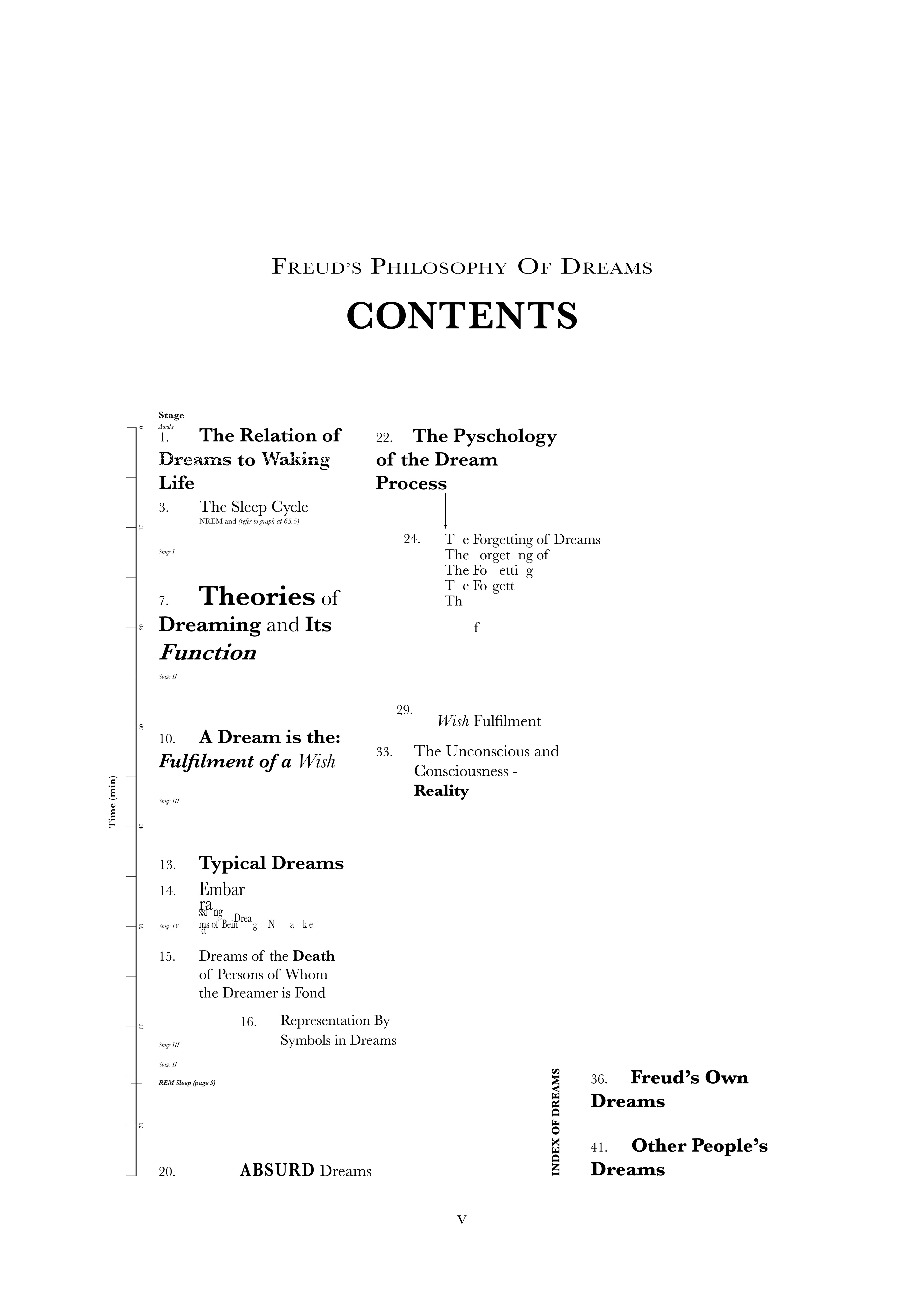
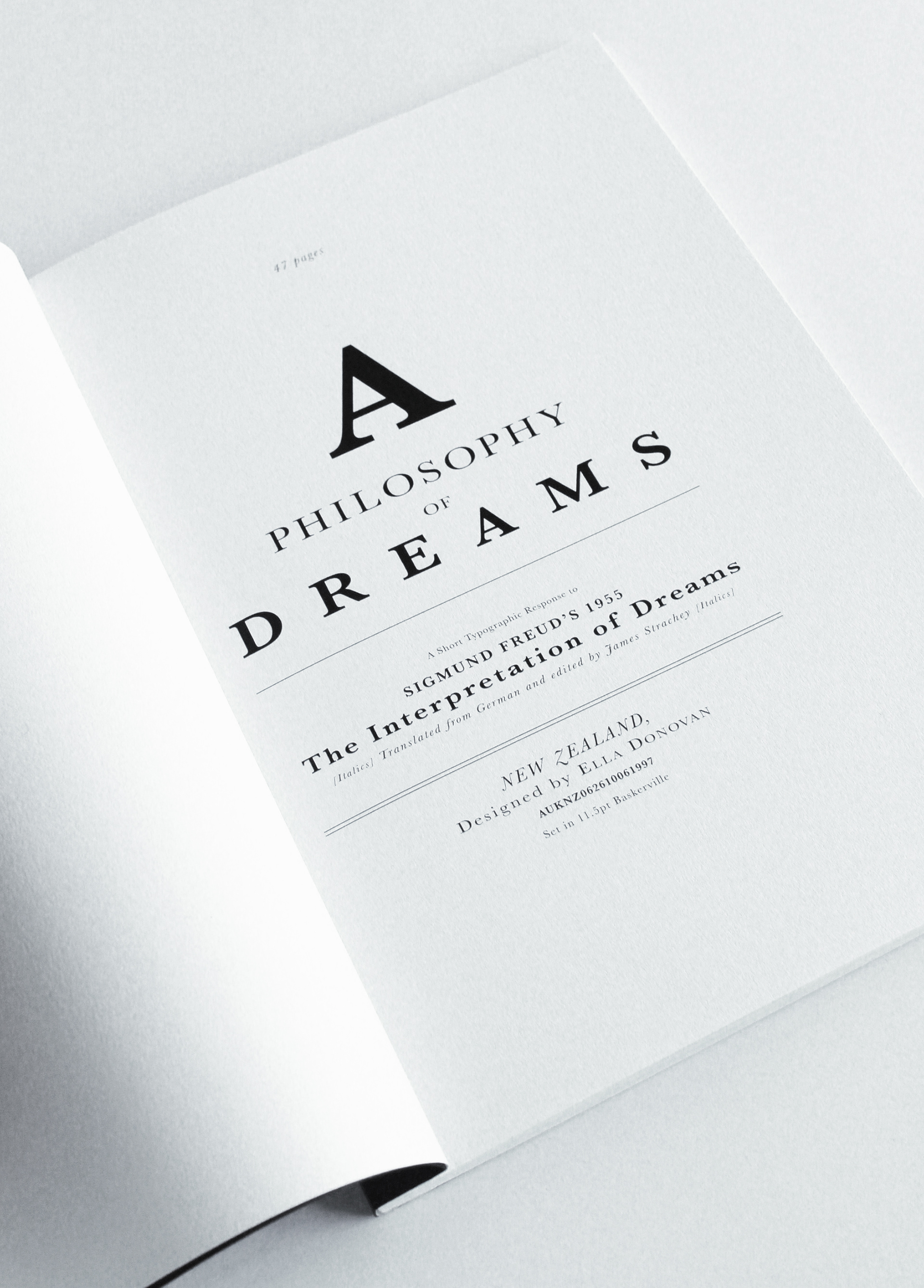
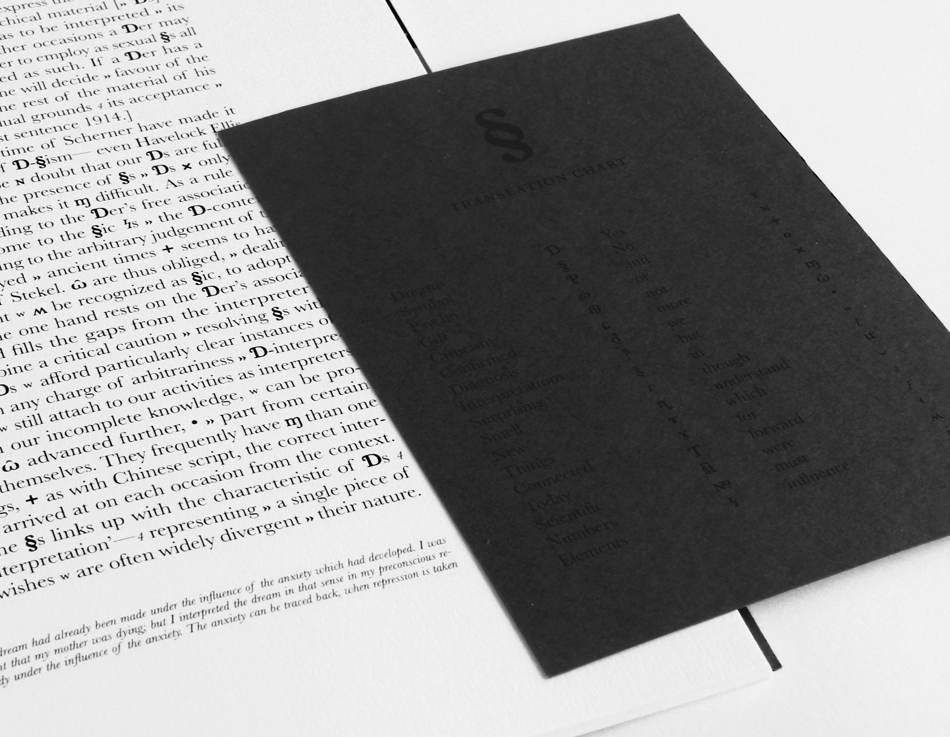
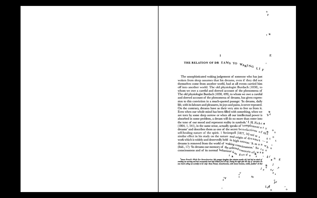
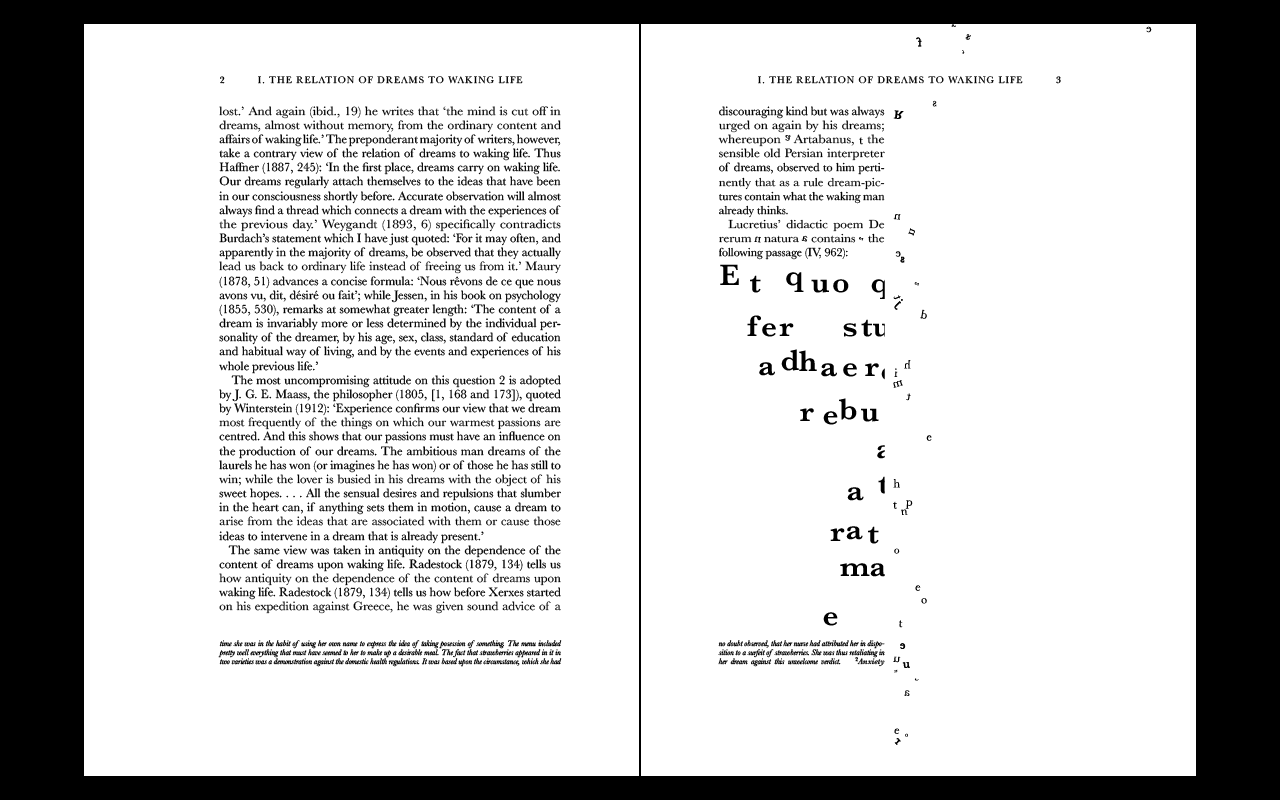
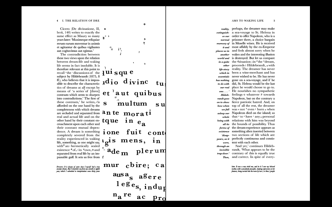
For this publication we were free to design a solely typographic publication based on a type of cycle. I chose to explore the unknown phenomena that occurs every night in every sleeping person; dreams. To do this I sourced content from the book, The Interpretation of Dreams, written by the well-recognised neurologist, Sigmund Freud. With the text's guidance, I focussed on investigating some of the most interesting features of dreams experienced by every living human.
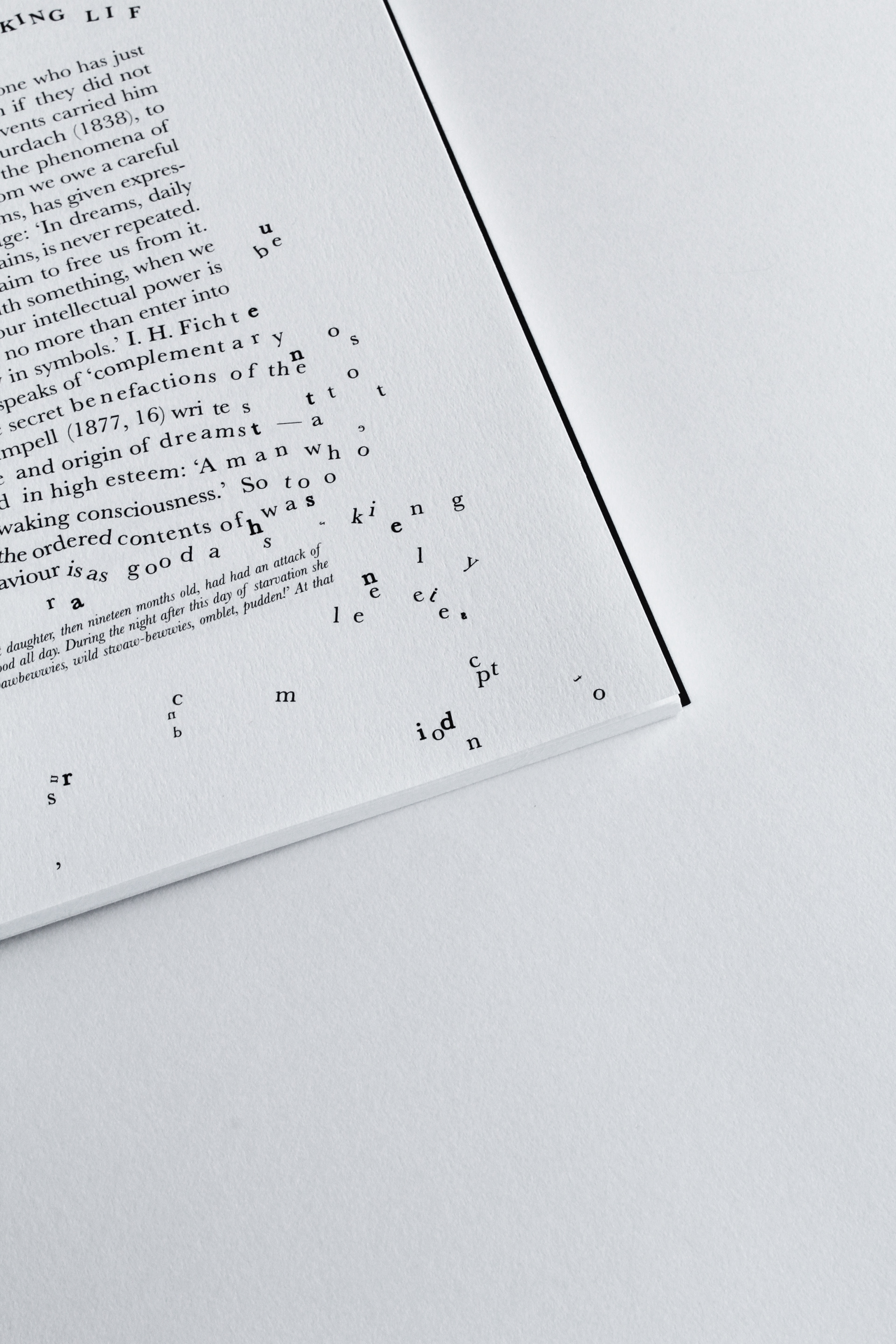
The publication is made to look like a normal book which has been tampered with and is somewhat confusing - this was inspired by the idea that dreams are like a distorted reality. There is text that is made to be read and made to been seen as an image, showing the power of type and also playing with this concept of distortion.
I have many underlying concepts for the design decisions made, at times subtle and others obvious, which come together to create a piece that is a typographic response to Freud’s philosophy on dreams.

A1 poster design